Zuzana Licko
Type Designer & Innovator

Introduction
The name Zuzana Licko brings to mind two words; Innovator and Experimenter. Throughout her career Zuzana has created many different fonts and entered the world of digital design that for her predecessors, was a truly unknown industry. It’s hard to pinpoint what she is most famous for, her company Emigre? Her many typefaces? Or perhaps her role as one of the first female designers to use digital technology to create, design and influence the typefaces we know and love today.
"It’s not a problem of being a woman in a man’s world. It’s being a type designer in a world that gives little recognition to this art form"
- Zuzana Licko
EARLY LIFE
Zuzana was born in 1961 in Bratislava, Czechoslovakia. In 1968, she and her family emigrated to the United States due to her fathers work. From the get-go Zuzana was fascinated by design, photography and architecture before her father introduced her to computer programming which she studied for several years. Zuzana’s first exposure to computers was due to her father, the biomathematician at the University of California, San Francisco. As an adolescent, Zuzana would spend her summers interning for her father at the university, helping him process data using industry standard computers at the time. The very first typeface she created was the Greek alphabet for her father. He commissioned her to create this typeface for personal use. This was her first experience in creating typeface designs for clients.
When Zuzana moved onto higher education, she enrolled at the University of California at Berkeley. She originally planned to study architecture but she changed to a visual graphics course as she felt architecture was too similar to going to “business school”. She graduated in 1984 with honours in graphic communications.
During her University life, Zuzana met her partner; in both business and life, Rudy VanderLans. Zuzana and Rudy both Graduated in ’84 and shortly after they started Emigre. Possibly one of Zuzana’s greatest achievements throughout her career. In an interview with Eye, Zuzana talks about her relationship with her husband:
“We met at the University of California at Berkeley where I was an undergraduate at the College of Environmental Design and Rudy was a graduate student in photography. This was in 1982-83. After college we both did all sorts of design-related odd jobs. There was no direction. Then, in 1984 we started Emigre, and everything seemed to click. And still does.”
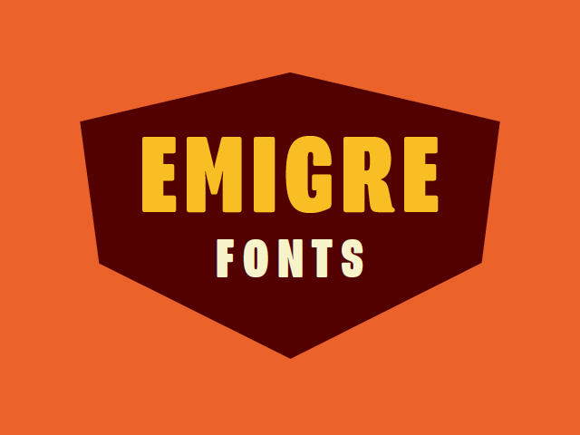
EMIGRE
Fresh out of University, Zuzana and partner Rudy embarked on the biggest project of both their careers, Emigre. Also known as Emigre graphics, Emigre is a type foundry that creates and distributes typefaces. Emigre was started in 1984, the same year the personal computer Macintosh was unveiled to the world. Emigre took advantage of the power of the Macintosh to create digital typefaces. Zuzana began designing fonts that, rather than trying to imitate letterpress technology, changed the idea of bitmap design and dot matrix printing. This was a whole new world of design that Zuzana was entering and rather than fear the consequences, she explored the fast possibilities of this industry.
“When I started building Macintosh bitmap fonts in 1984, it was a purely experimental endeavour. I didn’t have a client for these fonts, nor did I plan to start a type foundry. It was Emigre magazine that opened up these options.”
- Zuzana in an interview with Rhonda Rubinstein.
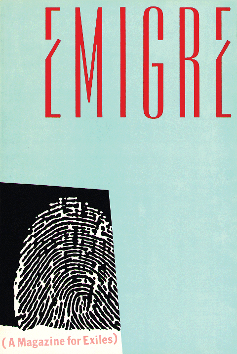
Emigre is credited the first type foundry to design original fonts made on and for computers. This in itself is a groundbreaking achievement for Zuzana. Coinciding with the birth of Emigre type foundry, Emigre magazine was born. This publication was created at the beginning of Emigre to have a platform to showcase the typeface designs and possibilities of the company to audience much wider than the digital design circle. Emigre magazine was best known for its graphical experimentation, criticism and essays on contemporary design. The magazine not only showcased Emigres range of fonts but other work by designers in the field of type design.
Throughout the magazines run, Zuzana and Rudy were often criticised for ‘rejecting standard design rules’. Emigre received much criticism from Designer Massimo Vigelli, calling the foundry a “typographic garbage factory”. He even went to the length of stating that Emigre was a ‘degradation of culture’. Critisistic herself, Zuzana knew how to deal with negative comments and she would often say:
“People read best what they read most”
Meaning that certain typefaces are deemed ‘best’ because people are familiar with them not because of their design. Zuzana has said that the magazine is “a magazine for exiles”, one which pushes boundaries and ignores expectations.
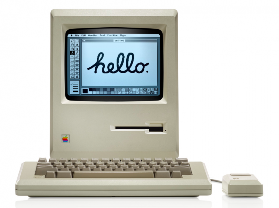
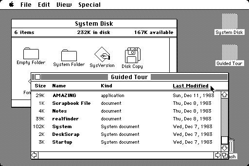
RISE OF THE MACINTOSH
In 1984, Apple released the first Macintosh computer, now known as the Macintosh 128k. With the release of this new technology, came the release of the GUI (graphical user interface). This concept of having windows, icons, menus and a pointer on a computer was new for many and it was the first time designers such as Zuzana were exposed to such technology. Captivated by the equipment, Zuzana began to design digital typefaces on the Mac. Due to the machine having low resolution outputs, Zuzana had to design fonts that would display nicely on the machine. Hence she used low-res outputs to create high-res solutions. One of the first font she designed was ‘Lo-Res’, a sort of ‘pixelated’ looking typeface that could be used as a typeface for video games for example. As the technology of the Mac continued to improve over the years, so did Zuzana’s typeface designs. An excellent example is her Bodini remake ‘Filosofia’ which she created in 1996.
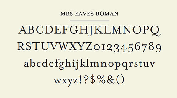
MRS EAVES
One of, if not the most famous typeface created by Zuzana is Mrs Eaves; the Baskerville revival, created in 1996. Zuzana created this font in admiration of the predecessor, Baskerville. Mrs Eaves is named after Sarah Eaves, John Baskerville's wife. Much like Baskerville, Mrs Eaves is cut like a traditional serif typeface but with a few unorthodox updates. Mrs Eaves lower case characters are reduced in height and the thickness of the typeface is thinner making the font appear softer and more organic. Zuzana designed this typeface to give designers a more up to date model of the famous Baskerville style that can be used for publishing and advertisement for example. Mrs Eaves was first seen in Issue 38 (The Authentic Issue) of Emigre magazine.
Zuzana stated in an interview with Eye (No. 43, Vol. 11, Spring 2002) why she liked her Baskerville revival:
“I think Mrs Eaves was a mix of just enough tradition with an updated twist. It’s familiar enough to be friendly, yet different enough to be interesting. Due to its relatively wide proportions, as compared with the original Baskerville, it’s useful for giving presence to small amounts of text such as poetry, or for elegant headlines and for use in print ads. It makes the reader slow down a bit and contemplate the message.”
This idea of reviving a classic typeface for a more elegant purpose is fascinating to me and shows what kind of designer Zuzana was. She focused on how to refine typefaces and make them suitable for uses in todays world. This was also seen for Filosofia, where she cut a much more refined font than the original Bodini.
HER TYPEFACES
| Typeface | Year | Style |
|---|---|---|
| Lo-Res (9, 12, 15, 22, 28) | 1985 | Modular |
| Modula | 1985 | Serif |
| Citizen | 1986 | Sans-Serif |
| Matrix | 1986 | Serif |
| Lunatix | 1988 | Sans-Serif |
| Oblong | 1988 | Sans-Serif |
| Senator | 1988 | Serif |
| Variex | 1988 | Sans-Serif |
| Elektrix | 1989 | Script |
| Triplex | 1989 | Serif |
| Journal | 1990 | Script |
| Totally Gothic | 1990 | Decorative |
| Totally Glyphic | 1990 | Decorative |
| Matrix Script | 1992 | Script |
| Matrix Inline | 1992 | Serif |
| Modula Tall | 1992 | Serif |
| Narly | 1993 | Decorative |
| Dogma | 1994 | Sans-Serif |
| Whirligig | 1994 | Decorative |
| Base 9 & 12 (serif & sans) | 1995 | Serif/ Sans-Serif |
| Soda Script | 1995 | Script |
| Mrs. Eaves | 1996 | Serif |
| Filosofia | 1996 | Serif |
| Base Monospace | 1997 | Sans-Serif |
| Hypnopaedia | 1997 | Decorative |
| Tarzana | 1998 | Sans-Serif |
| Solex | 2000 | Sans-Serif |
| Fairplex | 2002 | Serif |
| Puzzler | 2005 | Decorative |
| Base 900 | 2010 | Sans-Serif |
| Program | 2013 | Sans-Serif |
AWARDS
Throughout her career, Zuzana has received much criticism from the design world but she has also been awarded some very prestigious awards such as the Chrysler Design Award in 1994, which she was awarded with her husband Rudy. In 1996, Zuzana and Rudy were awarded the Publish magazine Impact Award for their outstanding work on Emigre . The following year the pair won an American Institute for Graphic Arts Gold Medal Award. In 1998, Emigre was awarded the Charles Nyples Award in Innovation in Typography. This list of awards just shows how outstanding Zuzana’s typefaces are and how innovative the foundry has been throughout the years.
MY THOUGHTS
I, in particular find Zuzana’s work to be extremely innovative. Throughout her career she has continued to push the boundaries in design and refine typefaces for private and commercial use. Her design skills have grown from her very first digital font ‘Lo-Res’, 1985 to her more current typefaces such as ‘Program’, 2013. I believe she has impacted the design world a great deal, not only being one of the first female designers to harness the power of the Mac, but to be one of the first designers to create high resolutions typefaces while working with limited technology. I feel like she has paved the way for digital typeface designers today.